


Key Takeaways
- Pearl CW-640 is a refined blue-gray with a cool, calming presence
- Features subtle green undertones that add complexity without overpowering
- With an LRV of 43.07, it sits comfortably in the mid-tone range
- Adapts beautifully across lighting conditions, shifting from crisp to moody
- Pairs effortlessly with rich burgundies, deep blues, and nature-inspired patterns
- Inspired by the historic homes of Colonial Williamsburg, and featured in "The Williamsburg Paint Color Collection" by Benjamin Moore
What is Pearl CW-640 by Benjamin Moore?
Pearl CW-640 from Benjamin Moore's Williamsburg® Collection is a timeless, historically inspired hue that leans into a modern aesthetic. Unlike traditional neutrals, this color brings a cool blue-gray sophistication that feels grounded yet elevated.
It's a versatile choice for homeowners and designers looking to introduce color while maintaining a calm, neutral foundation.

What is the Williamsburg Paint Collection?
"The Williamsburg® Paint Color Collection fuses traditional and modern design, transporting paint colors from the past to enhance contemporary living. Together with preservationists at the The Colonial Williamsburg Foundation, Benjamin Moore's chemists and color experts examined 18th-century wallpaper, original paint samples and historical documents to accurately recreate colors found in early American design. These distinctive colors still influence design today with their array of vibrant hues, rich shades and classic neutrals. Whether you live in a colonial-style home or use this timeless palette to complement modern architecture and furnishings, the Williamsburg® Paint Color Collection never goes out of style."
— Benjamin Moore

Our Designer's Take
An airy entryway, sophisticated sitting room, or timeless, tranquil library. Welcome to the world of Pearl CW-640. As endearing as it is elevated, this powdery blue hue with hints of grey and green can carry its own weight in any space without seeming too sweet. Thoughtfully created with 18th century design in mind, Pearl shines as a modest, modern accent, cool and soothing color drench, or the perfect hue to enliven and elevate incredible built-ins inherited with a Craftsman style home.
Inspired by the colors of 18th century wallpaper, Pearl pairs beautifully with the timeless designs of William Morris. Morris created intricate, storied floral and bird motifs — most popularly perhaps, "The Strawberry Thief" — which is seeing a brand new age of interest as "cottage core" and "granny core" aesthetics and hobbies are sweeping social media. Pillow cases, art prints, coffee mugs, switch plates and lampshades — a vast and rapid democratization of what was once coveted has taken place. As recently written in The Guardian in 2025, "The visionary designer never achieved his dream of art for all in his lifetime. Now his prints are everywhere. He would be thrilled and appalled." In their original application and intent, however — rich fabrics, captivating wallpapers — William Morris will truly never tire in our homes. If you are bold enough to pattern drench (why shouldn't the drapes match the sofa and the walls!?), William Morris is a world of possibility, with endless complementary patterns and color palettes to play with.

Color Specification and Details
Pearl CW-640 is best described as a balanced blue-gray that carries a soft, muted elegance.
- Cool-toned and serene without feeling cold
- Mid-depth color that adds presence without overwhelming a space
- Slight softness that prevents it from feeling too industrial or stark
- Works well in both contemporary and classic interiors
- This is the kind of color that adds quiet character — noticeable, but never loud
LRV
With a Light Reflectance Value (LRV) of 43.07, Pearl CW-640 sits right in the middle of the spectrum.
- Reflects a moderate amount of light
- Helps maintain depth and dimension in a room
- Ideal for spaces where you want color without going too dark
Undertones
Pearl CW-640 carries cool blue-gray undertones with a subtle hint of green.
- The blue keeps it crisp and calming
- The gray grounds the color and adds versatility
- The green undertone introduces a soft, organic feel
- These undertones shift gently depending on lighting, giving the color a dynamic, lived-in quality

Lighting Considerations
Bright rooms:
- Appears lighter and more blue-forward
- Feels airy and fresh while still grounded
- Green undertones remain subtle
Low light:
- Deepens into a richer gray-blue tone
- The green undertone becomes slightly more noticeable
- Creates a cozy, moody atmosphere
By room orientation:
- North-facing: Cooler light enhances the gray and blue, creating a crisp, tailored look
- South-facing: Warmer light softens the color, balancing the coolness beautifully
- East-facing: Appears brighter and fresher in the morning, more muted later in the day
-
West-facing: Gains depth and a slightly greener cast in the afternoon and evening

Color Pairings with Pearl CW-640
Ruby Dusk 1267 by Benjamin Moore
A deep, warm burgundy that contrasts beautifully with Pearl's cool tones. It adds richness and drama and is perfect for accents, furniture, or statement walls.
Deep in Thought AF-30 by Benjamin Moore
A moody, introspective blue-gray that complements Pearl's undertones. It creates a layered, tonal palette and is ideal for offices, cabinetry, or ceilings.

Walthamstow Wallpaper in Forest and Teal by William Morris
A nature-inspired pattern featuring deep greens and teals. Walthamstow — an area of great significance to William Morris — is an adaptation of an artwork for carpet, held at The Huntington. Its vertical border, sketched initially in graphite, contains stylised honeysuckles, which the design team have incorporated in this beautifully translated pattern, with mirroring indicative of the typical 19th-century style. Honeysuckles, daisies, and acanthus leaves all swirl together in a striking repeat, edged by a checkboard border. It enhances Pearl's subtle green undertones and brings movement and classic design into the space.
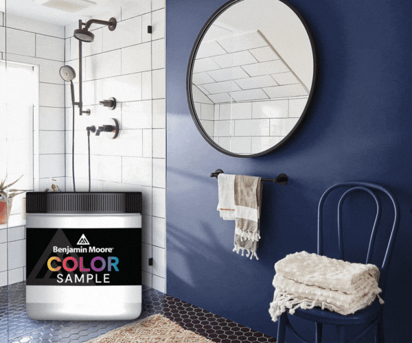
Get A Sample from JC Licht
The best way to experience Pearl CW-640 is in your own lighting and space.
At JC Licht, you can:
- Pick up a Benjamin Moore sample in-store
- Order online for convenient pickup
- Work with our color experts to build your perfect palette
- Stop by your local JC Licht and bring this sophisticated, historic hue to life


